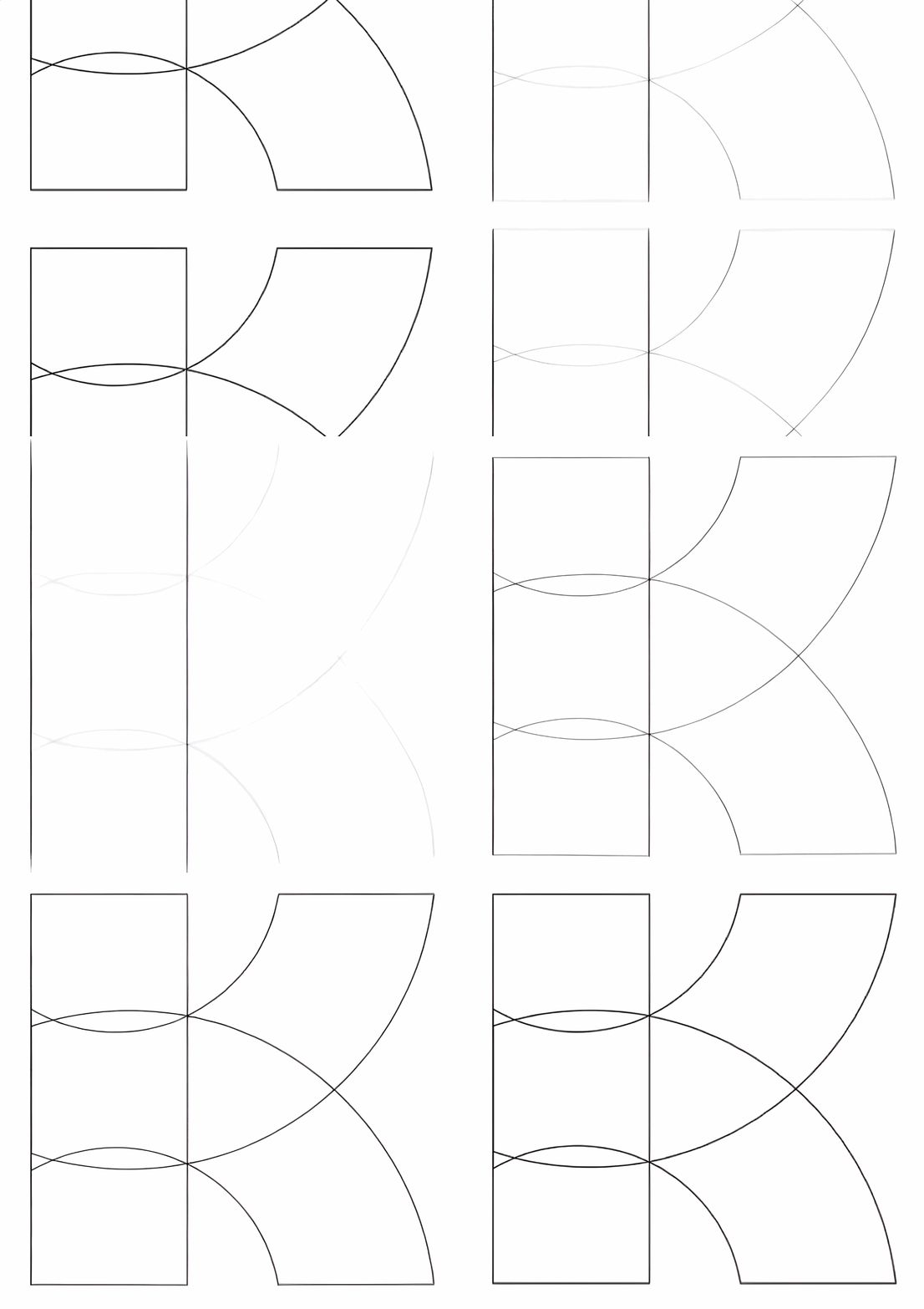


Identity
Brand Identity for a physical therapy practice that pinpoints the source of limitation, ensuring the right methods lead to progress.
Crux isn’t just a name, it’s the founder’s philosophy. Every detail focuses on the pivotal moment, bringing skill and presence to the point where transformation starts. The approach is attentive and insightful, grounded in the belief that everyone can move forward. Crux values what can be measured and what must be sensed. Each client is seen as a whole person and invited to step into new possibility on every level.
Crux

The challenge: Capture the shift where expertise meets intuition. This is where the story changes and healing begins. Recognize what others overlook and find the turning point where a life, a body, a story hangs in the balance. More than physical therapy, it’s deep attention shaped by years working with elite athletes, where the smallest detail defines the outcome. It is the crux.
Identity
Brand Identity and naming, for a physical therapy practice that pinpoints the source of limitation, ensuring the right methods lead to progress.
Crux isn’t just a name, it’s the founder’s philosophy. Every detail focuses on the pivotal moment, bringing skill and presence to the point where transformation starts. The approach is attentive and insightful, grounded in the belief that everyone can move forward. Crux values what can be measured and what must be sensed. Each client is seen as a whole person and invited to step into new possibility on every level.
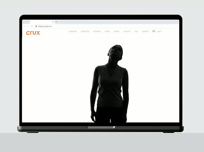
Website. Visual storytelling defines the Crux experience. On the site, movement and language are seamlessly integrated. Each gesture mirrors the accompanying phrase through universally relatable motions. This interplay embodies the Crux philosophy: progress emerges by addressing the pivotal issue with individualized approaches. The tagline, “Circle your crux. Rewrite your story.” is made tangible through the visual narrative, offering every visitor an immediate and personal connection to the brand.

Story Emerging. Wordmark unfolds across a large screen in the treatment room. A visual narrative where a rewritten story emerges. Inspired by the sunrise, this sequence envelops viewers in warmth and awe. The colors echo dawn, filling the space with a sense of calm and renewal. More than decoration, this animation is designed to soothe and inspire, inviting each person to pause, reflect and witness the possibility of transformation that Crux embodies.

Tactile Connection. Business cards are designed to leave an impression. The weighty stock, signature orange core and variety of backs invite touch and conversation. White-backed cards offer space for handwritten words, adding a personal dimension. Every card is a reminder that transformation is rooted in presence, intention and the resonance of genuine connection.

Redefining Vision. The introduction post unveils the new Crux identity by bringing together a reimagined approach to physical therapy, the illustrative wordmark and an invitation to explore further. Designed to spark curiosity and draw viewers in, encouraging them to visit the website (cruxdpt.com) for in-depth information about the methods and philosophy behind Crux, including dry needling, breathwork and advanced yoga practices beyond traditional hands-on therapy. Stay connected @cruxdpt.
Bridgeport Seawalk

The challenge: To think about what it means to walk along the water’s edge—to see the city from a new perspective, to feel both connected and free. The Seawalk is about movement and gathering, about nature and city, about Bridgeport’s history and its next chapter. The mark would become the unifying thread for a project that will grow and evolve for years to come. It’s not just about a logo; it’s about giving Bridgeport’s shoreline a face and a future.
Identity
Brand Identity for the walking path that stretches 20 miles, tracing Bridgeport's neighborhoods and shorelines.
A pathway that will reshape how Bridgeport connects with its coastline, its neighborhoods and itself. The Bridgeport Seawalk is more than a trail; it’s a 20-mile invitation to experience the city’s waterways, a thread tying together nine neighborhoods and a new front porch for the entire community. This is a place where the everyday and the extraordinary go hand in hand: sunrise jogs, family strolls, spontaneous conversations and the sweep of the Connecticut shoreline all in one.

Proposal: A visual campaign for the Bridgeport Seawalk is built around a clear sense of place, history and transformation. The first series of visuals would position branded kiosks throughout Bridgeport, paired with a coordinated social media rollout to debut the new Seawalk. Each element is designed to ground the Seawalk in the city’s storied past while signaling its fresh identity.
On the left, the Ferry Landing serves as an anchor—a nod to Bridgeport’s legacy as a gateway to Long Island, rendered through the intimate gesture of two sets of legs when a couple embraces. This moment of connection speaks to the personal memories and encounters that have always defined this historic site. At the center, a bold new identity for the Bridgeport Seawalk claims space visually and conceptually, while the rightmost image, emblazoned with “Old port. New Seawalk.”, encapsulates the campaign’s narrative: continuity and renewal.

As an ongoing campaign the motif of feet—striding, pausing, exploring—becomes a visual thread that ties together a few of the key destinations along the route: The Seaside Stretch, Olmsted Park and the Artist’s Nook. Each stop is introduced through animated feet, inviting viewers to imagine themselves journeying these revitalized spaces. Brief, evocative copy at the end of each animation roots these destinations in Bridgeport’s larger story, blending historical context with a forward-looking sense of discovery. This approach not only highlights the physicality of the Seawalk but reinforces its role as a living, evolving connector—linking the city’s past to its future, one step at a time.
Gallivant Racing

The challenge: Build a brand that moves; visually, physically and conceptually. Mobility isn’t just a feature; it’s the foundation. Every element, from the red continuous route line to its adjustable color, was created to work wherever the race goes, from jackets to medals to the side of a rolling truck. The goal: an identity that feels dynamic and real, something anyone can step into, mile after mile, place after place.
Identity
Brand Identity for a mobile race company that comes equipped with all the resources needed for events.
Born from the relentless spirit of a former world champion triathlete, Gallivant Racing set out to redefine what it means to bring world-class competition to the heart of local communities. The vision: make the exhilarating, transformative experience of triathlon accessible everywhere, not just in distant, exclusive venues, but on the streets and trails people call home.

The GR rig stands ready—purpose-built, unmistakable and engineered for any challenge.
Gallivant Racing rolls in with everything: expert crew, custom course design, pro timing and a setup able to transform any location, rain or shine. Every detail is handled—from safety to celebration—making race day seamless and accessible.

Waterproof jackets for the crew—on the water or on shore. Sealed seams, pockets where needed and a hood that stays put to keep distractions out of the way. The bold, red-orange stands out against grey water and shifting skies. The GR mark signals presence, even from a distance.

The banners are more than signs—they serve a purpose. Placed strategically around the course, racers rely on them for both orientation and wind cues. They're made from durable, weather-resistant material that stands up to the elements, yet light enough to catch the wind and indicate its direction. Their size is balanced: easy to hang wherever needed, but visible enough to be useful markers throughout the venue.

A bold, textured stitched GR stands proud on the side of the cap. The red is impossible to miss, whether you’re in the thick of the race or scanning the pit for your crew. The cap was built for long days under open skies.

Every detail of the vest is intentional. Designed for race day’s tempo, it keeps the crew connected—radios and phones slip easily into the pockets.
At the collar, a subtle GR lets you know you’re part of the crew—never a walking ad. Flip it to the orange side when visibility matters, whether you’re working behind the scenes or need to stand out.
Beneath the vest: the essentials. Each volunteer gets a white, lightweight tee and an orange sleeveless top—clean and sharp crew. Effortless athletic style, made for the course but not out of place if you grab coffee afterward.

Overall winners medals for men and women. First, second and third place are finished in gold, silver and bronze. They’re not made of precious metals, but they carry real weight and purpose. The finish may look simple, but what gets you there never is. These are medals for those who show up, dig deep and earn their place at the line.
Each medal hangs from a white strap, custom-printed for each race location and designed to snap on and off with ease.

This stitch cap takes a subtle approach—the GR is smaller, tucked neatly to the side.
It’s made for the behind the scenes crew, but it works just as well for anyone who wants something thoughtfully designed and comfortable enough for everyday wear, whether you’re working or relaxing. You’ll find it available to purchase at the venue, ready for anyone who wants to bring a bit of the atmosphere home. No pressure, just a well-made piece that fits naturally into life.

For the top three winners in each age group, the cheers last a little longer. Each winner gets a pint glass, etched with the GR logo—a trophy that actually belongs in your kitchen. Raise it after the race, fill it with whatever feels right and let it remind you that your effort deserves a real toast. Not just another medal—something you’ll reach for and remember, long after the finish line.
The GR applications demonstrate the range and versatility of the identity, with select pieces already in use and others ready to support Gallivant Racing’s future growth.
City Secrets

The challenge: Create a brand and first City Secrets volume that feels like a personal journal—intimate, inviting, and carefully crafted. This is more than a travel guide; it shares insider stories from architects, artists, chefs, and historians who reveal the city’s hidden layers. The design should be sophisticated and warm, with a handcrafted feel that sparks curiosity. Every detail needs to reflect the city’s true spirit. This first volume sets the standard for a series that uncovers secrets and leaves a lasting impression.
Imprint
Drawing inspiration from the intricate tops of ancient keys, the imprint for City Secrets unfolds into a clean, modern key shape that feels both timeless and fresh.
Ancient keys, with their detailed craftsmanship and mysterious designs, hold stories of hidden treasures and carefully guarded secrets. By transforming this rich symbol into a sleek, contemporary form, the guide invites readers to unlock the city’s hidden layers. It’s an invitation to go beyond the obvious, to open doors to places and stories waiting to be found.

Bound in cloth with a three-quarter jacket, thread sewn and finished with head and foot ribbons, City Secrets: Rome is as much an object as it is a guide. With its dye-stamped spine and blind debossed cover, the book offers a tactile experience that honors the tradition of great bookmaking.
The design was recognized by the American Institute of Graphic Arts (AIGA) 50 Books | 50 Covers competition, which selects the best 50 book and cover designs from around the world each year—a hallmark of excellence in graphic design since 1923. Even in a digital world of TikToks and Reels, the enduring pull of thoughtful design remains. AIGA’s recognition is a reminder that a well-made book can still draw readers in and reward them for lingering on every page.
With this honor, City Secrets: Rome has been added to the AIGA Design Archives—one of the richest online resources for those who practice, study and appreciate great design—as well as the physical archives at the Denver Art Museum (1980–2012) and the Rare Book & Manuscript Library at Columbia University's Butler Library in New York City.

Interior view: Endsheets, map and divider spreads show how the design strips away excess, focusing on clarity and usability. Even within a small format and single-color palette, the layouts keep maps easy to read and highlight only the most meaningful information. Readers can use these pages to quickly find new places nearby, plan their next day’s route, or look up details from specific contributors—all with just a glance.
New York Review Books

Imprint
The NYRB imprint design traces a writer’s arc: a tangle of thought gathers itself, finding shape and meaning in a completed work.
An identity that captures the journey of the writer. Nodding to the writer’s imperfections from the process of thought to the revision. It’s about making visible what happens inside a writer’s mind and on the page. The process suggests both the raw energy of first drafts and the clarity of finished prose.
The challenge: Design an identity for New York Review Books that stands out, but knows when to step back. It must honor literary tradition, flex across print and digital and capture both the wildness of a rough draft and the polish of final prose. More than an imprint, it’s a tribute to the craft; the unpredictable, meaningful work of making books. It should echo that journey from chaos to clarity, leaving a mark as lasting and classic as the words themselves.

A stack of spines, each marked with the NYRB imprint, stands as a series of signatures. The identity repeat; threads these works together.
A throughline: distinct voices, unified by a single mark of thought made clear.

The identity, printed on the title page of every New York Review Books edition. It signals the commitment to fearless inquiry and the revival of bold, overlooked works. “New York” anchors it to the city that inspires its restless curiosity—a powerful statement of place, purpose and an ongoing mission to bring important works back into the light.

On screen, the NYRB imprint sits at the top, defining the space with clarity. Its role is architectural: it frames a collection where fiction, non-fiction, poetry and translation each command attention. Every work reintroduced by today’s most compelling writers and inviting the reader to think anew.
This same clarity and purpose shaped the design of the first Classic series covers and interior templates. A few of those original award-winning designs are shown above. The series design demanded a balance of vision and restraint, honoring the legacy of the text while bringing a fresh sophistication to the series. To bring all of this together—imprint, cover, interior, and the careful curation of content. It’s a body of work that stands apart and was highly recognized for its design. An example of how design can give literature new life.